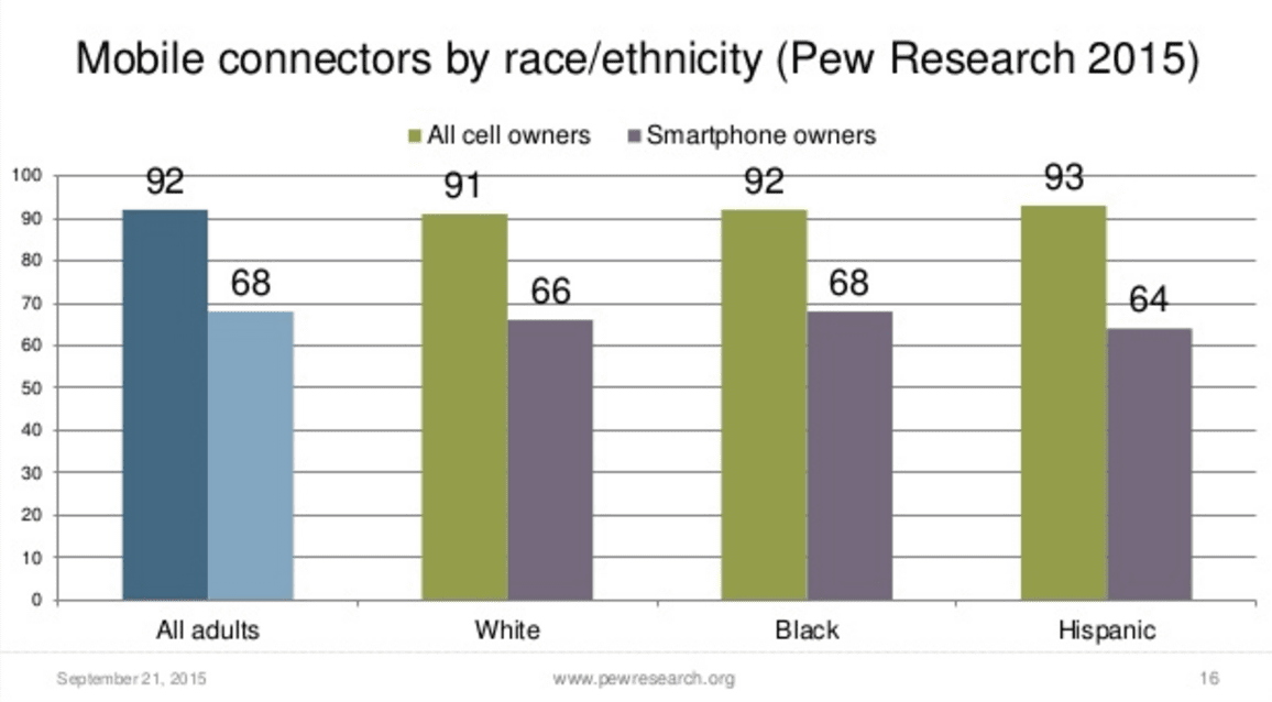
Yesterday you looked at a bunch of data from the Pew Research Center that was all presented visually in graphs and charts. The question is: why? Why did they choose to make a bunch of charts and graphs rather than just showing the raw data itself?
- “Why did Pew Research choose to make a bunch of charts and graphs rather than just showing the raw data itself?“
- “List a few advantages and disadvantages (at least 2 for each) of using visualizations to communicate data”


