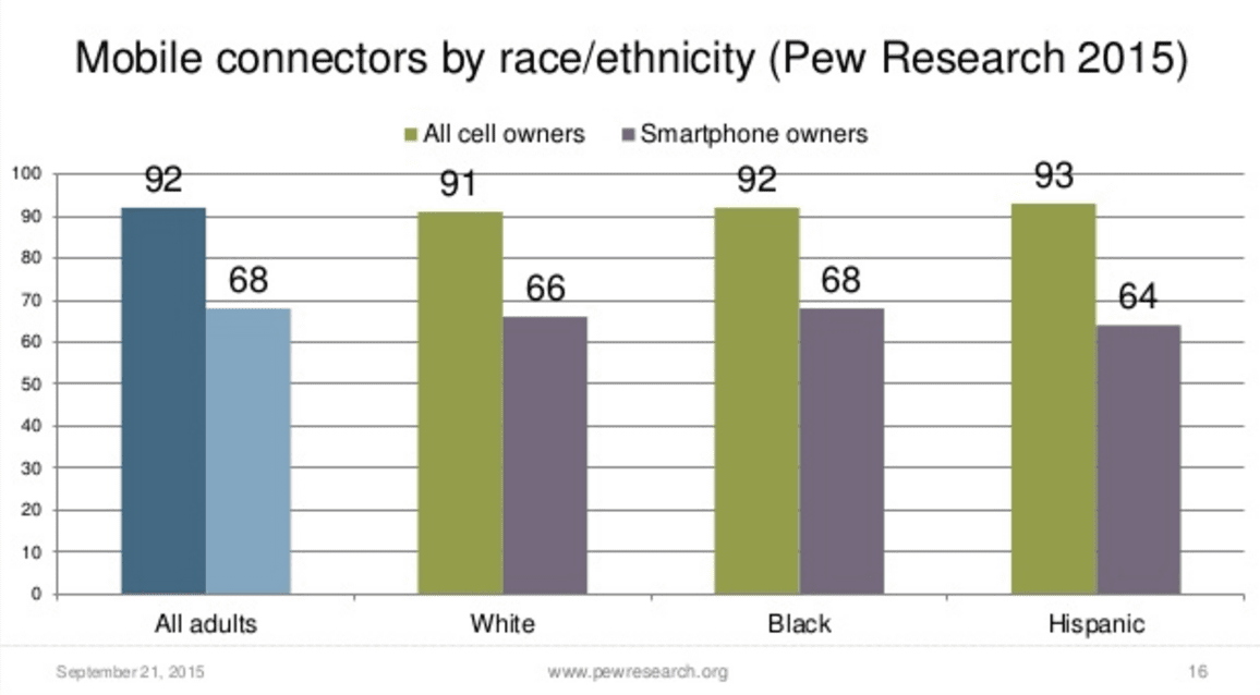
Yesterday you looked at a bunch of data from the Pew Research Center that was all presented visually in graphs and charts. The question is: why? Why did they choose to make a bunch of charts and graphs rather than just showing the raw data itself?
- “Why did Pew Research choose to make a bunch of charts and graphs rather than just showing the raw data itself?“
- “List a few advantages and disadvantages (at least 2 for each) of using visualizations to communicate data”
graphs are easier and catch more attention than just a bunch of words
ReplyDeleteAdvantages: pictures allow you to compare things more easily, easier to see trends or patterns, can focus on, or highlight, particular aspects of the data that are important
Disadvantages: easy to mislead or miscommunication, removes details that might be important or valuable, sometimes very dense - takes a while to study to understand what it means.
So it can be easier for people to read and understand.
ReplyDeleteAdvantages: pictures allow you to compare things more easily, easier to see trends or patterns, can focus on, or highlight, particular aspects of the data that are important
Disadvantages: easy to mislead or miscommunicate, removes details that might be important or valuable, sometimes very dense - takes a while to study to understand what it means.
1. Pew Research decided to make a bunch of charts to compare it to other statistics and see what data is essential.
ReplyDelete2. Advantages: It is easier to understand. It separates things into categories.
Disadvantages:People may misinterpret the information. The information may be inaccurate or misrepresented
Pew Research decided to alter the charts and graph in order to simplify and generalize. A disadvantage to altering the charts and graph would be the lack of preciseness, and possibly focus more on a certain group which can lead to discrediting equality. The advantages once again, are providing a much more modified data which permits simplicity. Also it allows one to quickly understand with a simple glance.
ReplyDeletePew Research made chose to create charts and graphs to show their data and research in order to simplify the information gathered. Additionally, simplified information will lead to data being easily interpreted.
ReplyDeleteAdvantages: Viewers can gain essential information based on a topic easier and can compare trends/data much easier.
Disadvantages: Information can be interpreted incorrectly and not most data provided is black and white, there is usually information supporting in between.
The research decided to make charts to compare to others and statistics. A disadventage is that information can be misrepresented and the advantage is it makes catergories and is readable.
ReplyDeleteSeat Research chose to make a group of diagrams to contrast it with different measurements and see what information is fundamental.
ReplyDeleteDisadvangtages points: It is less demanding to get it. It isolates things into classifications.
Disadvantages:People may misjudge the data. The data might be incorrect or distorted
Advantages: pictures permit you to analyze things all the more effortlessly, less demanding to see patterns or examples, can concentrate on, or highlight, specific parts of the information that are vital
ReplyDeleteDisadvantages: simple to misdirect or miscommunication, evacuates subtle elements that may be vital or important, now and again exceptionally thick - takes a while to study to comprehend what it implies.
They made the data more simply for people to read instead trying to figure out raw data. The advantage is the that its easy to read the data, and an disadvantage is that the data may not be fully accurate
ReplyDeletePew Research Made A Bunch Of Charts So That People Can Actually See The Differences.
ReplyDeleteOne Advantage Of Using Visualizations To Communicate Data Is That The Data Is Better To Understand Everything.
One Disadvantage Is That Some Of That Data Could Be Incorrect.